
Making of: Şimdi heißt jetzt
In spring 2020, Şimdi heißt jetzt (Şimdi is now called) was published by Slanted Publishers. The book was shortlisted for the “Most Beautiful German Books” award. In this blog post, I would like to offer some insight into how “Şimdi” came about.
“There are few things as beautiful, yet also as exhausting, as making a book.”
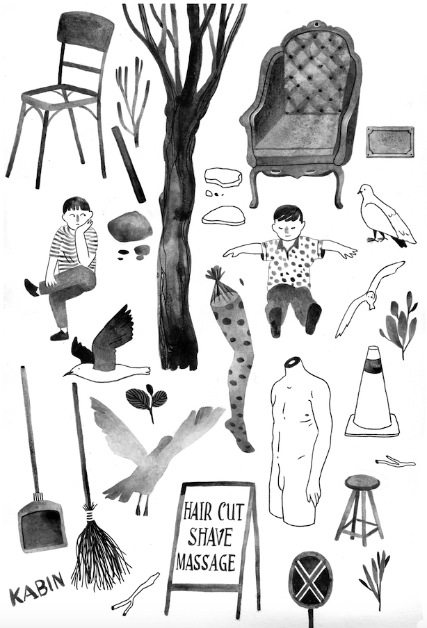
Unused sketches.

First sketches and notes.
The idea to “Şimdi”
Since my art residency in Istanbul in the spring of 2016, I have been exploring the relationship between Germany and Turkey for the cultural platform and online magazine Maviblau. In fall of 2017, while I was doing an internship at Missy Magazine, Navid Linnemann from Maviblau had the idea to launch a book project about Istanbul. This project would bring together various Maviblau authors (as well as some external contributors) to create a nuanced, diverse, and realistic portrait, incorporating their personal perspectives. Since I was desperately searching for a topic for my master's thesis, and this book idea was a dream project for an illustrator like myself, the decision was quickly made. Building on this initial idea, we further developed the concept within the Maviblau team.


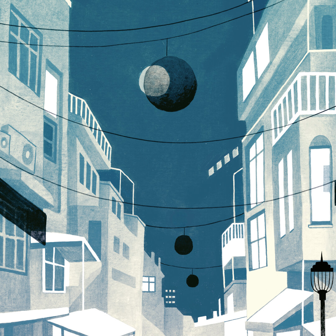
In a metropolis like Istanbul, new things are constantly being combined on both an aesthetic and a semantic level. I find this phenomenon very exciting because the different elements influence and reinforce each other. That's why I also wanted to use a collage technique in the book.


Illustrative Methods
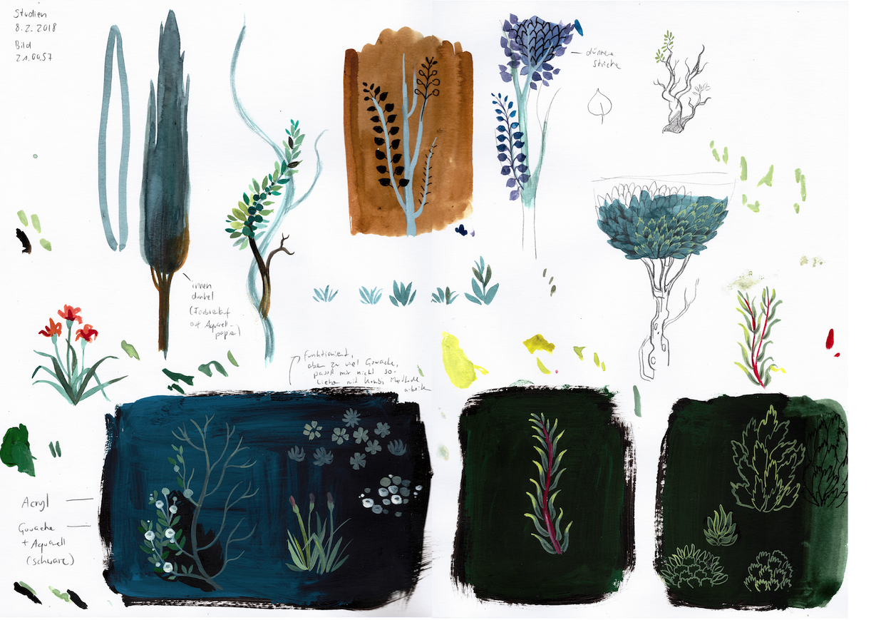
I already had gained experience with book illustration and design through the book "Frankfurt for Beginners." In that project, I initially illustrated individual motifs and later built the entire book design around these illustrations. For "Frankfurt for Beginners," I worked with a collage technique and black watercolor. In my master's thesis, I wanted to use this technique as well, but above all, I wanted to work with color and explore the possibilities and combinations of digital tools. Therefore, I developed a mixed analog-digital technique that gives me maximum freedom while simultaneously maintaining the look of the analog techniques (watercolor, ink, gouache) I use.

Illustration in use
Unfortunately, it was clear from the project planning stage that the texts weren't available and wouldn't arrive for several months. Therefore, I had to prepare to work with summaries or even just titles. But how was I supposed to present the text if I hadn't even read it? I struggled with this problem for a long time. Even after I received the first texts and created matching illustrations, it still didn't feel right.
Until it dawned on me: book illustration isn't editorial illustration (which is pretty obvious, but it took me a while to realize it).
Editorial illustrations serve an important purpose in magazines because you don't sit down and read the whole magazine from cover to cover like you would a book. With a book, you have more time, so the illustrations don't have to summarize the text's message. Since it was going to be a book with various personally colored factual texts, I wondered if there could also be a "subjective yet factual illustration" that doesn't depict exactly what the text is about. Perhaps I could show something additional, reading between the lines of the texts to find ideas for the subject matter—or show something that's only peripherally related to the topic and opens up a new context.

Snapshots turn into drawings
The illustrations now function alongside the texts as my contribution as an author. At the same time, they connect all the texts in the publication to one another. Like the essays, they represent a blend of objectivity and a poetic approach, reflecting a personal perspective. Selecting the images and matching them to the texts was a crucial part of the process.
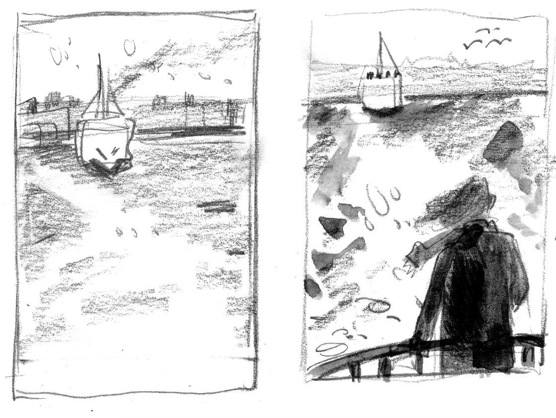
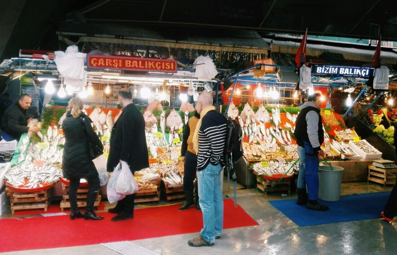
To find ideas for images, I searched through my image database of approximately 3,000 mobile phone photos I took in Istanbul. The idea behind this is that the illustrations in the book, like the texts, should reflect a personal point of view. Furthermore, with a self-taken, perhaps "ugly," photo, I find it easier to engage creatively, rather than being tempted to simply copy a beautiful image. It was fun sketching these thumbnails and experimenting with different compositions.
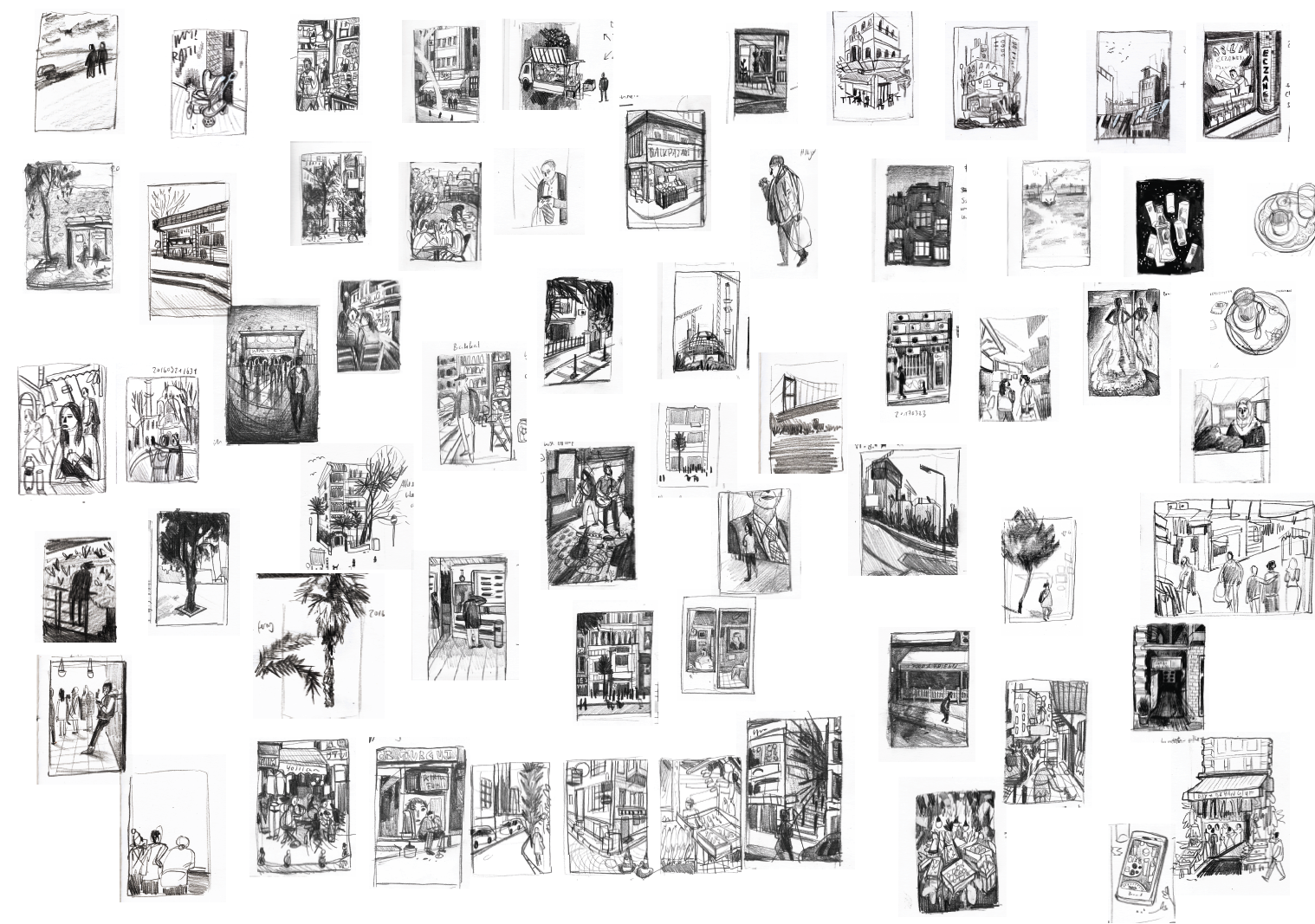
Sketch collection.


Everyday objects serve as inspiration for the color scheme. (Bus tickets, bills, banknotes, saucers, and a package of roasted chestnuts.)
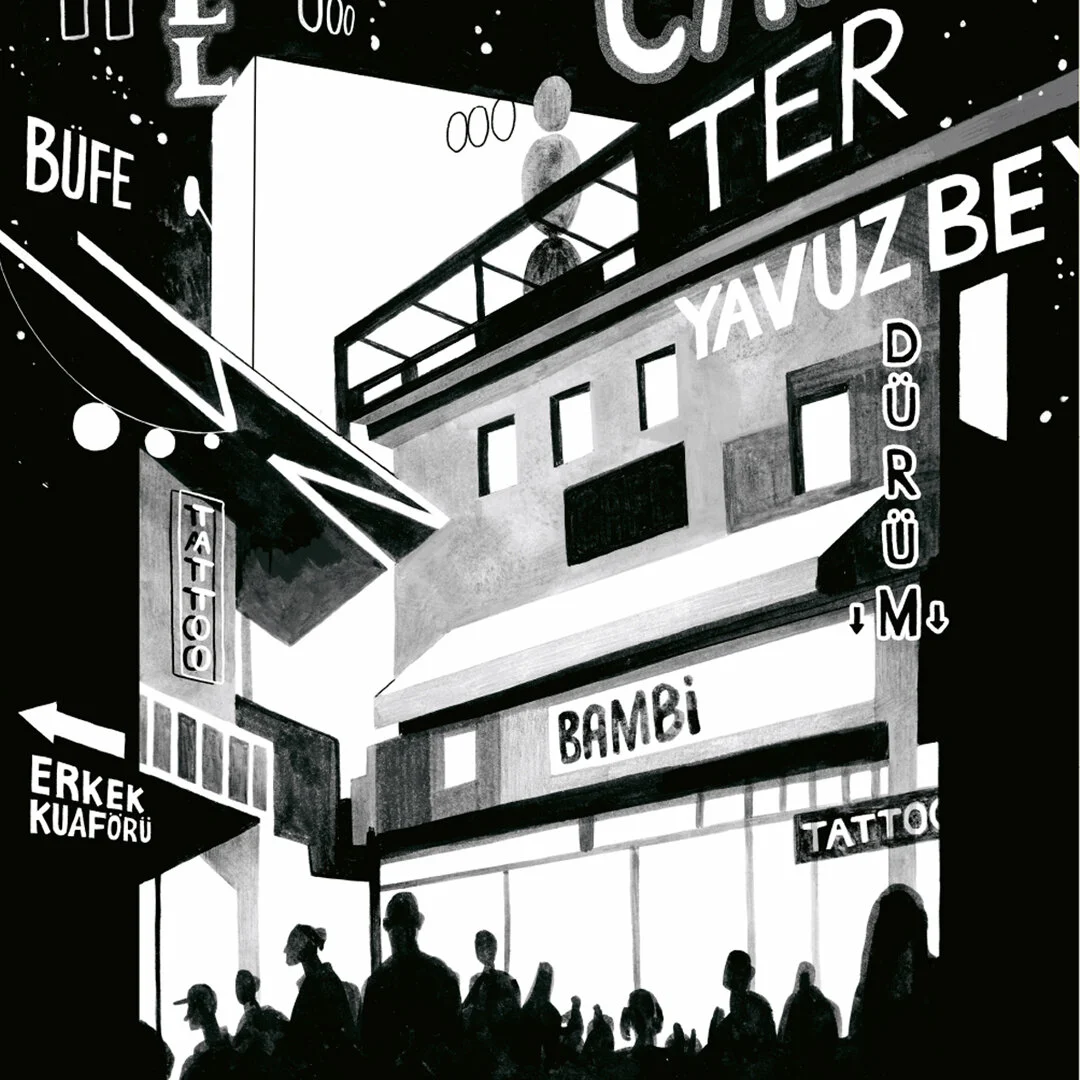
For the colors, I drew inspiration from found everyday objects. Although I worked with watercolor and ink in black and white, I wanted to add some color to most of the illustrations. I did this using gradients in Photoshop — a no-go for many designers, but if it suits the project, then it suits the project. To provide a counterpoint to the pleasing gradients, about a third of the illustrations in the book are still in black and white.


The final touch
The individual texts are accompanied by small black-and-white illustrations, which sometimes serve as commentary, sometimes as illustrations, reflecting the chaos of objects encountered in Istanbul.
I suggested the title "Şimdi heißt jetzt" (pronounced: shimdi) to the authors. The idea came to me from the song "Şimdi" by the Turkish band 123. Through its German and Turkish elements, this title also alludes to the name Maviblau – and reflects the concept of a subjective snapshot.

The finished book.